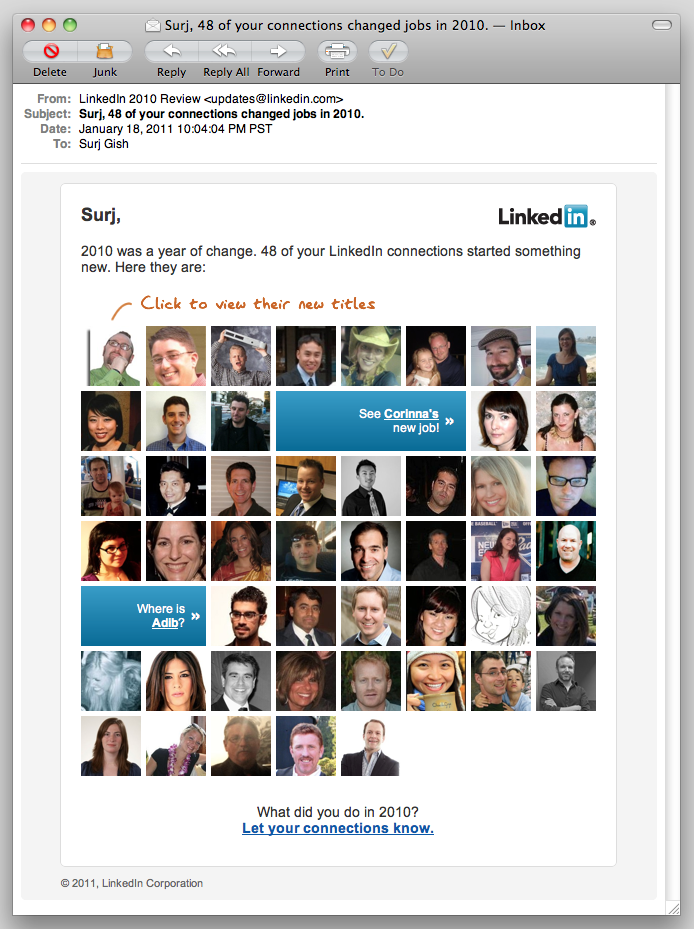
I almost always spend at least a few seconds (practically a lifetime, in the context of email marketing!) looking at the emails LinkedIn sends my way. The “LinkedIn Network Updates” are particularly interesting. I’m curious—I like to know what folks are up to. Previously, these emails have been pretty much HTML text with links on my connections’ names. Last night, LinkedIn sent the first email I’ve seen from them that really takes advantage of one of the powerful assets they have: user photos.

This isn’t an entirely new concept – MailChimp has had some social features for a while, although they had to rework them recently. One of the changes was the loss of the Faces feature. And Twitter’s “new follower” email has incorporated the user icon and basic info for a while now. But this LinkedIn email takes it further.
“Email personalization” still means “insert FNAME in the body somewhere” to a lot of email marketers. LinkedIn sent me an email with pictures of 48 people I know. You’re damn right I clicked on every one of them. Ok, maybe it was just most of them, but this is a very compelling way to drive visits to LinkedIn—here come the ad impressions!
Is this a test to see how users respond to photographs, before including photos in the network update emails? I wouldn’t be surprised if we start seeing photos in the regular updates emails soon.
What can we learn from this? The vast majority of email marketers don’t get to send their subscribers pictures of their friends and colleagues. We personalize based on purchase history, previous activity, and (hopefully) intelligent guesses. So how can we get creative and take our email personalization to the next level? Yes, I said “take it to the next level”—sorry. How about “raise the bar” instead?
Another question: why is Facebook still sending plaintext email notifications, instead of taking advantage of the vast wealth of stuff they have at their disposal? Is it concerns about privacy and privacy settings, or is just that most Facebook users are simply on the site so much more than LinkedIn, and don’t need as much enticement to be sucked back in?

