Hello Lucky Halloween Cards and Awesome Customer Retention Strategy

I’m a big fan of Hello Lucky. They make awesome letterpress cards – nice heavy paper and cool designs, especially the cards with monkeys on them. I’ve purchased lots of cards from local shops when I’m short on time, but I mostly I order direct from HelloLucky.com. Angelica has also ordered directly from their site.

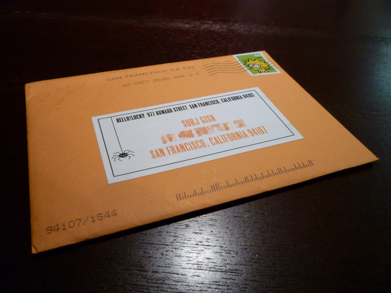
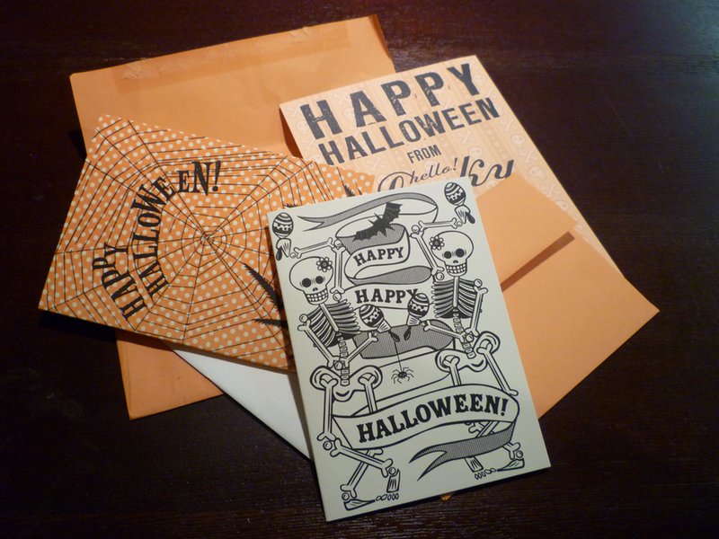
Last night, we found two envelopes from Hello Lucky in our mail – one for me, one for Angelica. Each envelope contained a “Happy Halloween From Hello Lucky” postcard and a blank Halloween card with envelope.

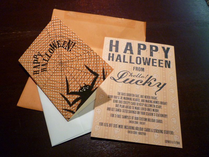
The postcard has a playful poem that basically says “Hey, it’s Halloween now, but soon it’ll be Christmas, so send this free card to someone now and make sure to plan ahead so you can send awesome cards for the holidays. Oh, and by the way, here’s a coupon code.” There are two codes: one for 3 free samples of holiday cards, and another for 15% off site-wide. The coupon codes have a pretty tight expiration date, which is good. This should help drive home the point of “It’s go time. Order your cards now.”

This is very interesting to me. I’m a jaded online marketer, so of course I immediately started dissecting their strategy. But I’ll admit I was totally jazzed to get a Halloween card from Hello Lucky, even if Angelica did get the cooler card.

I like to imagine that companies that are truly driven by passion for making awesome stuff and creating delightful experiences come by these kinds of marketing ideas in a “Hey, wouldn’t it be cool to just send some cards to our customers?” kind of way, with the number-crunching and ROI scenarios coming afterwards. Look, I know that this is essentially a free sample mailer. Not exactly a groundbreaking concept, but kickass in execution. I seriously doubt the average Hello Lucky customer who receives one of these is going to say, “Well, duh, they’re just sending me a free card so I’ll but more stuff from them.” They’re going to say, “AWESOME!”

  1. The sample is an excellent reminder of how great the Hello Lucky cards are. I get points for sending someone an awesome card, and Hello Lucky gets their cards in front of another potentially new customer.
  2. The timing is perfect – close enough to Christmas that it makes sense to buy holiday cards, but not so close that anyone will worry about whether the cards will arrive in time to mail out in time for Christmas/Hanukkah/Kwanzaa/Festivus.
  3. In spite of having not one, but two coupon codes, the whole thing feels more like I just got something from a friend, not some smarmy hard-sell marketing materials. Plus, I get the option of using coupon code A to get more free stuff, or coupon B to get 15% off. Beautiful, and a nice test to see what folks will respond to.

Hello Lucky faces significant challenges in getting folks to order directly from them online. I don’t have any data on this, but I’d bet I’m not the only person who picks up cards on the way to the event the card is celebrating. It’s easy to grab a crappy, last minute greeting card at the grocery store if I’m not planning ahead. Mailing cards in a timely fashion? Very difficult for me.

This campaign short-circuits those issues, with a physical reminder of the very high quality of Hello Lucky’s cards and a sensible nudge to get a jump on the holiday season. I’d bet lots of folks will be thankful not only for the coupon, but for the gentle reminder as well. Nice work.

Carving Pumpkins, Halloween 2010: Templates Are For Suckers

I love Halloween, always have. One of my favorite things about Halloween is carving pumpkins. I never use a template; I prefer to come up with my own crazy designs.

This year, I found a really great pumpkin at Clancy’s over in the Inner Sunset. He was a squatty little fella with a unique shape, like he already had a face before I even started taking pieces out of him. I almost wanted to leave him as-is. Almost…

Angelica and I had a small pumpkin carving party at our place last night. I went to work on Mr. Spooky Jack O’Lantern, capitalizing on his interesting natural shape. I used a narrow blade and a small scraper for removing surface material. The wire is simply paperclips I cut to length and bent to fit.

New Twitter Makes Twitter.com More About Tweeting and Slightly Less About Easy Page Branding

Last week, I noticed that I’d been blessed with The Gift of The New Twitter. Since I go to my Twitter page about as often as I go to church, I may have had it for a while and just not noticed. For shame!

Anyway, the first thing I noticed was that my carefully crafted, super-rockin’ Twitter background was compromised. My background was designed to work in the left 190 pixels or so, but now, even with my browser window at full screen, it’s barely getting full exposure. My primary machine is a 15″ MacBook Pro with a resolution of 1440×900 – not exactly a narrow screen – so I’ll need to rework it.

There’s a more comprehensive writeup over (with PSD files!) over at Mashable, but basically new Twitter starts at a minimum width of 920 pixels and maxes out at 1040 pixels, compared to old Twitter’s static width of 763 pixels. The timeline is 540 pixels wide, with the right area (your tweets, followers/following, who to follow, etc) expanding from 380 to 500 pixels depending on available browser window width.

I think the new Twitter page layout is a real improvement, in particular the bigger emphasis on “who to follow.” For many casual users, it’ll give them a bit more functionality and perhaps keep them using the Twitter website instead of an app – something I’m sure the Twitter folks are eager to encourage. But in the end, I just don’t care all that much. I use Tweetie and Tweetdeck on my laptops and Twitter for iPhone on my phone, so it won’t change how I use the service. However, Twitter is taking is taking ownership of their own pages a bit more. The vast expanse of wide open space for branding your with a Twitter background image will be less visible now – we’ll all have to be a bit more thoughtful how we use the available space.

Discussing Moto Guzzi Cafe Racers Over Breakfast

Friday morning breakfast discussion, inspired by a particularly perfect example of a Guzzi cafe racer – basically a low barred, GP-piped 1000S built from an ’02 Stone with an injected 1000 cc motor – in the October/November 2010 issue of Cafe Racer Magazine.

Surj: “We need to get a Moto Guzzi.”
Angelica: “We need to get cereal.”
Surj: “That’s not the same.”
Angelica: “Yes, but it’s something we actually need.”

New 2011 Triumph Speed Triple Photos. Me Likey.

One of my favorite modern motorcycles is the Triumph Speed Triple. I like ’em all, but my favorite generation is the 2005-2010 1050 cc model. I had a 2007 Special Edition, and it was an amazing motorcycle. It was set up just right, and that Arrow pipe had a real nice growl  – not insanely loud, but nice. I regret selling it every time I see a Speed Triple on the road.

2007 Triumph Speed Triple Special Edition
My 2007 Triumph Speed Triple Special Edition. We wants it, we needs it. Must have the precious.

Hell For Leather posted some photos today of the 2011 Speed Triple and I spent a good long time drooling over ’em. I like the new bike, in fact I like it a lot. But… I think I still like the ’05-’10 – or at least my ’07 SE – more. The new S3 is pretty muscular looking and has a bit more go-juice (7 more ponies and 6 more ft/lb of torque) to back up that look but so far I think I prefer the look of the current frame over the new version. Also, although the headlights aren’t as bad as some of the other more “transformer-y” styled bikes of the last couple years, they look wrong to me. I love the round “bug eyes” that have until now been one of the hallmarks of the S3. Check out the ridiculously named new Thunderbird Storm; dual roundies are still ok in 2011 – why not keep ’em on the original bug-eyed street fightin’ bike?

There’s no doubt in my mind that this new S3 is gonna be a sweet bike, but I think I’d prefer to get my hands on another ’05-’10 to set up like my ’07 SE.