Solving Customer Experience Problems with Social Commerce: Infused Facebook eCommerce

Go Smile, where I’m General Manager of eCommerce, was featured in the Jill’s Steals and Deals segment of the Today Show in late 2010. Obviously, this was huge in many ways – the traffic spike was unbelievable. The website was almost instantly brought to its knees.

I’d been talking to the folks at Infused Commerce about their Facebook Store solution, and reached out to them to see if we could get something live quickly enough to help serve the massive number of folks coming to the site as a result of the Today Show deal. Keep in mind, this was short term demand – the deal was supposed to last 24 hours, and although we had upgraded our servers in preparation for the traffic, it wasn’t enough. We were turning away site visitors – a bad experience for would-be customers, and a loss of opportunity in terms of new customers, email signups and brand reputation.

Incredibly, the guys at Infused were able to get our Facebook shop live within hours. We posted the link on our temporary home page, and by the end of the day had processed a huge number of orders through the Facebook store – almost twenty times our normal daily website order volume in a single day. The launch was a resounding success, and really helped mitigate the poor experience experienced by some folks having issues ordering on the main site.

Unfortunately, due to some issues we ran into while trying to integrate with our fulfillment partner (who will remain nameless) we had to take the store down temporarily. We thought it’d be down for a few weeks at the most, but due to a an ridiculous comedy of delays and freakouts from the fulfillment company, it took months to make the integration happen.

We finally launched the Go Smile Facebook store again last week. We haven’t been pushing it much just yet – taking a few orders and watching for issues with the fulfillment integration. But I’m planning some excellent campaigns very soon – this is a powerful tool to drive not only orders and revenue, but fan count and engagement. More to come on that soon.

Right now, the Infused Facebook shop application works in typical product feed fashion – very simple. The store itself is a Flash app that lives in an FBML tab on your company’s Facebook page. If you’ve sold stuff or advertised on Amazon, you’ll be able to set up your Facebook shop in your sleep. The Infused team sets up the store with your brand colors – you just need to provide some basic files like a logo and a “front door” image along with your product feed, and you’re ready to roll. The orders are pulled from a secure URL. Easy peasy.

I can’t say enough nice things about the Infused team. While the curent beta version of the Facebook shop sports a pretty basic feature set, they’re moving fast – they’ve made vast improvements to the product since I first talked to them a few months ago. There are other companies doing this, but it’s been a pleasure working with them. It’s a classic startup story – they’re new and hungry, with a small agile team capable of moving very quickly. Their customer service has been excellent, and they’re attentive to our needs. They eat up feature requests like candy, and in some cases stuff I’ve asked for has shown up a few hours later! The pricing is excellent, too – less than most companies give up to affiliates, and there’s no commitment.

Small brands – this is an easy, effective way to make your Facebook page a powerful tool in your customer acquisition toolbox. The buy-in is very small, and implementation is incredibly easy and fast. Do it now!

Distance to Discount Ratio? How About a Work to Incentive Ratio?

Today, TechCrunch called out some numbers from the folks over at JiWire that quantify how far people are willing to travel to get higher levels of discounts. Wait – people will travel further for bigger discounts? No way!

Kidding aside… first, this overly simplified take on the data makes me think a lot of people way undervalue their time. 40 percent of respondents will travel up to an hour for a 40% discount on a $100 item? People – haven’t you heard of Woot?

Second, while the implications of this are pretty obvious for location-based promotions, I’d love to see some data that tells the story of how much “work” people will do in exchange for incentives online. How many friends’ email addresses will Joe sell out share in exchange for more vegetables for their virtual farm? How many completely irrelevant offers will Franklin click on to build up points for a gift card? How many times will Susie refresh a page to get a free sample worth less than a buck? What are the incentives required to get engaged users of your product to enthusiastically tell their friends?

I ran a promo in late 2010 where a beauty product that’s normally $89 was offered on an extremely high profile national TV show for just $10. The resulting traffic to the website was roughly 500 times average. The site slowed to a crawl, and would-be customers had difficulty purchasing. One of the most amazing things about this offer was the number of people who complained angrily via Facebook and the more traditional customer service channels that they’d been “refreshing for ten hours” to make the purchase. Important feedback, and very helpful in understanding the level of emotional investment in the product, but the time investment people were willing to give up was way higher than I’d have suspected. The vocal folks in this case were a small minority compared to the overall sales, and I think it’s important to not place too much value on the anecdotal information. Still, ten hours of refreshing to save $79 on a non-essential cosmetic product?

Now THIS is Email Personalization: LinkedIn Connections Email

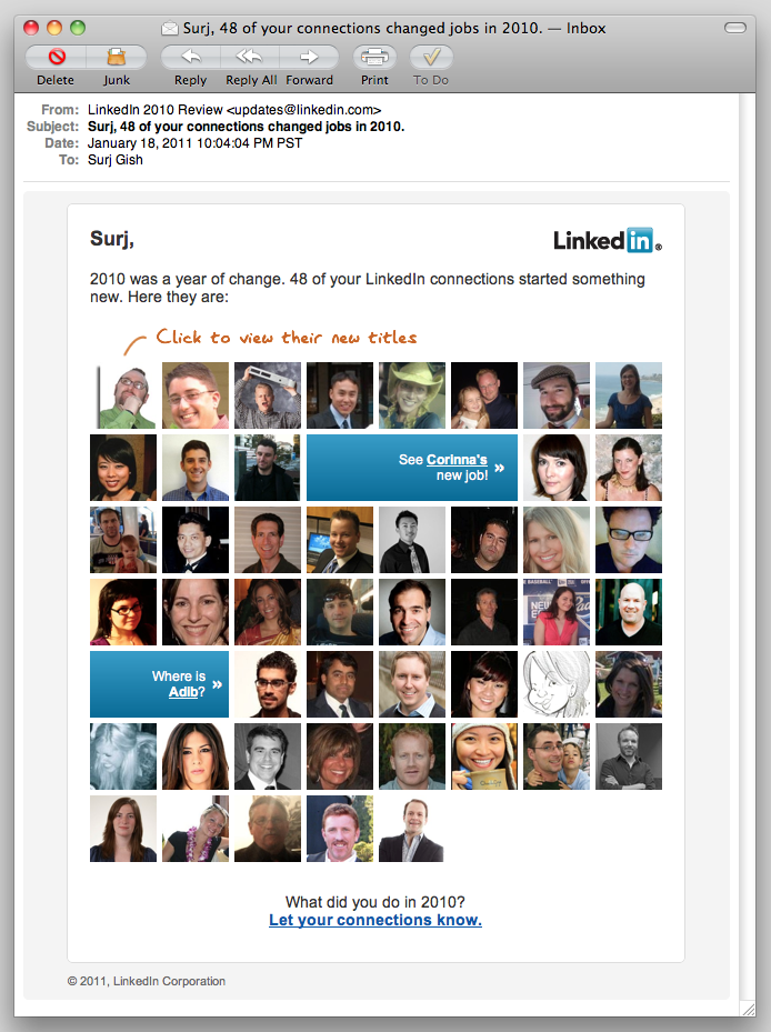
Screenshot of personalized email from LinkedIn.

I almost always spend at least a few seconds (practically a lifetime, in the context of email marketing!) looking at the emails LinkedIn sends my way. The “LinkedIn Network Updates” are particularly interesting. I’m curious—I like to know what folks are up to. Previously, these emails have been pretty much HTML text with links on my connections’ names. Last night, LinkedIn sent the first email I’ve seen from them that really takes advantage of one of the powerful assets they have: user photos.

Screenshot of personalized email from LinkedIn.
“Surj, 48 of your connections changed jobs in 2010 – and here are pictures of every last one of ’em!”

This isn’t an entirely new concept – MailChimp has had some social features for a while, although they had to rework them recently. One of the changes was the loss of the Faces feature. And Twitter’s “new follower” email has incorporated the user icon and basic info for a while now. But this LinkedIn email takes it further.

“Email personalization” still means “insert FNAME in the body somewhere” to a lot of email marketers. LinkedIn sent me an email with pictures of 48 people I know. You’re damn right I clicked on every one of them. Ok, maybe it was just most of them, but this is a very compelling way to drive visits to LinkedIn—here come the ad impressions!

Is this a test to see how users respond to photographs, before including photos in the network update emails? I wouldn’t be surprised if we start seeing photos in the regular updates emails soon.

What can we learn from this? The vast majority of email marketers don’t get to send their subscribers pictures of their friends and colleagues. We personalize based on purchase history, previous activity, and (hopefully) intelligent guesses. So how can we get creative and take our email personalization to the next level? Yes, I said “take it to the next level”—sorry. How about “raise the bar” instead?

Another question: why is Facebook still sending plaintext email notifications, instead of taking advantage of the vast wealth of stuff they have at their disposal? Is it concerns about privacy and privacy settings, or is just that most Facebook users are simply on the site so much more than LinkedIn, and don’t need as much enticement to be sucked back in?

New Twitter Makes Twitter.com More About Tweeting and Slightly Less About Easy Page Branding

Last week, I noticed that I’d been blessed with The Gift of The New Twitter. Since I go to my Twitter page about as often as I go to church, I may have had it for a while and just not noticed. For shame!

Anyway, the first thing I noticed was that my carefully crafted, super-rockin’ Twitter background was compromised. My background was designed to work in the left 190 pixels or so, but now, even with my browser window at full screen, it’s barely getting full exposure. My primary machine is a 15″ MacBook Pro with a resolution of 1440×900 – not exactly a narrow screen – so I’ll need to rework it.

There’s a more comprehensive writeup over (with PSD files!) over at Mashable, but basically new Twitter starts at a minimum width of 920 pixels and maxes out at 1040 pixels, compared to old Twitter’s static width of 763 pixels. The timeline is 540 pixels wide, with the right area (your tweets, followers/following, who to follow, etc) expanding from 380 to 500 pixels depending on available browser window width.

I think the new Twitter page layout is a real improvement, in particular the bigger emphasis on “who to follow.” For many casual users, it’ll give them a bit more functionality and perhaps keep them using the Twitter website instead of an app – something I’m sure the Twitter folks are eager to encourage. But in the end, I just don’t care all that much. I use Tweetie and Tweetdeck on my laptops and Twitter for iPhone on my phone, so it won’t change how I use the service. However, Twitter is taking is taking ownership of their own pages a bit more. The vast expanse of wide open space for branding your with a Twitter background image will be less visible now – we’ll all have to be a bit more thoughtful how we use the available space.