Jockey.com Email Marketing: Text, Please

It always bums me out when I’m talking email marketing with someone and they say something like “Why do we have to use all this text? Can’t we just put some images in there? [some huge brand] does it, and they must know what they’re doing!” I’ll usually go through the explanation of how images don’t always load, and it’s good to have your call to action and other messaging visible even when they don’t. Sometime they get it, other times they fall back on “Yeah, ok – but what about [some huge brand]? Why would that do it that way if it wasn’t the best?” Because we all know how every large brand is awesome at email marketing.

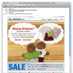
Anyway… Trolling through my emails this morning, I noticed this subject line: “We’re missing Christmas! Holiday favorites starting at $9.99.” Christmas, eh? Seems a little late for that messaging. But I was intrigued, and opened the email. Nice work, Jockey Email-Jockies!

But what did I see when I opened the email? A whole lot of nothin’!

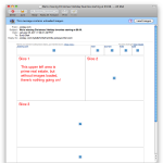
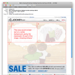
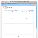
As you can see, without images loaded there’s not a whole lot to look at. The bummer is, it’d be super easy to do something cool with this by slicing up the image a bit more creatively, and using text in the white area. In the first image below, you can see the slices the Jockey email marketers used. In the second image, I show you how I would have done it.

Instead of just slicing up a mockup and calling it a day, I’d slice the images a bit differently, put ’em in a table and leave a white cell to place the text in. My basic table structure would look like this:


<table border="1">
<tr>
<td rowspan="2">Slice 1 here.</td>
<td>Slice 2 here</td>
<td rowspan="2">Slice 3 here.</td>
</tr>
<tr>
<td>Text here!</td>
</tr>
<tr>
<td colspan="3">Slice 4 here.</td>
</tr>
</table>

Easy, right? Well, those of us who code an email now and then know it’s not that simple, but that’s the gist of it. Now, if images don’t load, the recipient doesn’t have to wonder whether it’s worth loading images to see the message – it’s there in all its textual glory! Just be sure you test your code in the usual email clients to verify the text won’t blow up your table.

Look, I get that sometimes brand guidelines require certain fonts for everything, so you have to use images with those fonts in them. I also get that sometimes things are rushed. But it often doesn’t take much extra work to make sure folks are seeing your message whether images load or not, and it’s worth it. Text rules!

It’s the Third Week of 2011 – Time for a New Year Resolution?

I’m a total workaholic. I have trouble falling asleep many nights because even though I’ve “stopped working” my mind is still rolling through what happened today and what’s gonna happen tomorrow. I’ve long forgotten how to set up the autoresponder in my email clients because I never stop responding to email.

On one hand, this is good – I’m “driven” and “motivated.” On the other hand, it’s easy for important stuff to fall by the wayside. My own projects, working on my bike, riding my bike, this blog (almost every day I have entire posts constructed in my head that I don’t find time to actually type), happiness, life, love. So before the new year hit, I was already thinking I need to make sure I make time for real life.

I’ve noticed that one of my colleagues closes his office door in the middle of the day. What’s he doing in there? My office has a door? It does! Turns out he’s simply insulating himself so he can enjoy a few minutes of peace and quiet while he eats his lunch. Genius!

I’m not much for resolutions, but I’m going to start taking a lunch. I think I’ve only taken an actual “lunch” once in the past 6 months. Once. NOT OK.

So I’m going to start setting aside 30-45 minutes a day, around lunch time, to eat lunch (wha?!), catch up on the latest tidbits at The BARF and HellForLeather, read, and work on my own projects – including this blog. Here’s where I make my grandiose prediction of about how I’ll be less-stressed, more effective, and happier. There it is.

Now THIS is Email Personalization: LinkedIn Connections Email

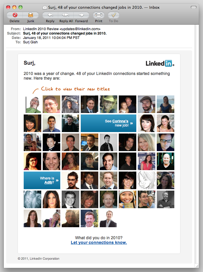
Screenshot of personalized email from LinkedIn.

I almost always spend at least a few seconds (practically a lifetime, in the context of email marketing!) looking at the emails LinkedIn sends my way. The “LinkedIn Network Updates” are particularly interesting. I’m curious—I like to know what folks are up to. Previously, these emails have been pretty much HTML text with links on my connections’ names. Last night, LinkedIn sent the first email I’ve seen from them that really takes advantage of one of the powerful assets they have: user photos.

Screenshot of personalized email from LinkedIn.
“Surj, 48 of your connections changed jobs in 2010 – and here are pictures of every last one of ’em!”

This isn’t an entirely new concept – MailChimp has had some social features for a while, although they had to rework them recently. One of the changes was the loss of the Faces feature. And Twitter’s “new follower” email has incorporated the user icon and basic info for a while now. But this LinkedIn email takes it further.

“Email personalization” still means “insert FNAME in the body somewhere” to a lot of email marketers. LinkedIn sent me an email with pictures of 48 people I know. You’re damn right I clicked on every one of them. Ok, maybe it was just most of them, but this is a very compelling way to drive visits to LinkedIn—here come the ad impressions!

Is this a test to see how users respond to photographs, before including photos in the network update emails? I wouldn’t be surprised if we start seeing photos in the regular updates emails soon.

What can we learn from this? The vast majority of email marketers don’t get to send their subscribers pictures of their friends and colleagues. We personalize based on purchase history, previous activity, and (hopefully) intelligent guesses. So how can we get creative and take our email personalization to the next level? Yes, I said “take it to the next level”—sorry. How about “raise the bar” instead?

Another question: why is Facebook still sending plaintext email notifications, instead of taking advantage of the vast wealth of stuff they have at their disposal? Is it concerns about privacy and privacy settings, or is just that most Facebook users are simply on the site so much more than LinkedIn, and don’t need as much enticement to be sucked back in?

It’s Cool, I Already Have an iPod Anyway

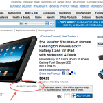
Does this mean they're sending me an iPad? As I’ve mentioned before, I subscribe to a lot of emails. Marketing research and all that. Wading through my “lists” inbox tonight, I noticed that the Costco has a Kensington iPad case with a built-in battery. Now, I don’t even have an iPad, but Angelica does, and I reckon with its already amazing battery life and the extra five hours this thing claims to provide, the iPad oughtta last us through the next nuclear winter, at least. And, it’s got a freakin’ kickstand, which according to that annoying animated billboard on the Oakland side of the Bay Bridge is a REALLY BIG DEAL.

So I click through, and what to my wondering eyes should appear? A free iPad from Costco!

Ok, it doesn’t actually say I get a free iPad, but it does say “iPod not included,” which I’m assuming is intended to clarify (for the non Tech Crunch readers) that you get an iPad, not an iPod.

AWESOME. Placing my order now.

Apple(weak)sauce – It Just Works. NOT.

Maybe it’s just daylight savings time that has me a bit grumpy this morning. I prefer to wake up when it’s still dark, or at least gray.

Or maybe I’m grumpy because my iPhone – an allegedly smart phone – failed me this morning.

I knew, or at least suspected, that it was going to happen. Both Angelica and I have iPhones, and reset our alarms last night, but just in case, I set the regular old alarm clock too. This morning, I was awakened by the beeping of that dinosaur, not either of our iPhones.

Look, I get that software is extremely complex. Mistakes are made, and missed in QA. Fine. I’m not a developer, so I’m not even going to bother theorizing about the nuts and bolts of why my alarm clock didn’t go off today. (Even though I’d have thought there’d be some best practices in place by now for automatic handling of alarm clocks and Daylight Savings Time. It’s not like this is bleeding edge stuff.)

Apple has been aware of the issue for at least a month, and even created a support article about it. But in typical Apple fashion, they were pretty quiet about it. In fact, if I hadn’t heard about it from Angelica, I wouldn’t have known about it at all. I’m a busy guy – I don’t pay attention to all the iPhone/Apple chatter. I shouldn’t have to – this thing is supposed to just work, right? Judging by the noise on Twitter this morning, I’m not the only one who didn’t notice until too late.

Just to make sure I hadn’t missed anything, I connected my iPhone to my MacBook Pro and fired up iTunes. Nope – no software update, no warning, no messaging at all. I did have to agree to YET ANOTHER iTunes Store Terms and Conditions update – maybe there’s a new clause that explains that the alarm clock doesn’t actually work.

This is a missed opportunity. Apple should have sent an email campaign with the workaround instructions, rather than relying on the blogosphere and the media, maybe even done some PPC marketing on keyword phrases like “iPhone alarm clock fix” with the support article as the landing page.

Hell, even AT&T could have done it, by email or text message. It’s not like they don’t need every bit of goodwill they can get from iPhone users.

Instead, we get a support article that doesn’t even make the iPhone Hot News page. Instead, we get people waking up late for work. Instead, we get people pissed off at Apple and maybe looking at one of those slick new Android phones instead of following the default next-gen iPhone upgrade path.

Listen up Apple. I love your products. I’ve sent a lot of cash your way. But dumb errors like this (and even dumber handling of them) makes me want to drink someone else’s Koolaid.

Shadow Bikers

Photo of shadow of riders on motorcycle.Angelica and I went for a ride today – a leisurely, almost touristy, two-up, chatting in the headsets kind of Saturday afternoon ride. We headed out of San Francisco, across the Golden Gate into the Marin Headlands and on. It was a positively magnificent day for motorbiking.

Angelica snapped this photo from the back of the bike near the end of the day. Super cool.

Subject Line Experimentation: Special Characters – Genius or Garbage?

Macworld email marketing subject line experiment screenshot.
Macworld getting a little crazy with the subject line.

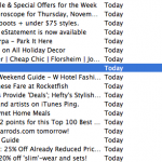
I subscribe to a LOT of email – I like to see what other email marketers are doing. Because of this, I get so much email that I’m in constant email overload mode (sounds familiar, I bet) and it takes something pretty spectacular – or really lame – to get my attention.

Taking a peek at my subscriptions inbox this morning, I saw an email from Macworld with a three character subject line: –>. That’s not me pointing at something, that’s the subject line. An arrow.

Ever the jaded online marketer, my first thought as I glanced through my emails was “Oops, someone screwed up personalization again.” Then I thought maybe some really crappy spam had snuck into my inbox somehow, until I saw the from: Macworld Gems.

I think overly gimmicky subject lines can be a bit of a risk, and tricks like this are usually one-shot deals. But, as we always say, “test, test, and test s’more!” So what were the email marketers at Macworld thinking on this one? Maybe in a vertical preview pane, the “look over here” arrow mechanism works. Maybe they just thought it’d be eye-catching.

For me, it just looked weird, like a mistake. But… I noticed it. What would a “normal person” (non-email marketer) think of this?

2011 BMW R1200R Classic: The Gentleman’s Hooligan Bike

My taste in motorbikes often runs towards the hooligan side of the street – such as my ’07 Speed Triple SE – but I also have a long-running love affair with comparatively “sensible” Boxer-engined Beemers, ever since I rode a buddy’s yellow R90S cafe racer many years ago. Lately, I’ve had my eye on a black and green Rockster around the corner at MotoJava – seems like it’d be a perfect 2-up city bike.

2011 BMW R1200R Classic

I wasn’t too excited when I heard there were mild updates to the R1200R for 2011, until I got a load of the R1200R Classic over on Hell For Leather. That’s right – chrome spoked wheels and black paint with white accents gets me every time. And the bike has had decent real world horsepower (110 hp and 88 ft.lb of torque) for a couple years or so now, although I have heard some significant complaints about the reliability of the 1200 engine. Very un-BMW!

I disagree, though, with Hell For Leather’s characterization of the BMW roadster rider as a slipper-wearing, pipe-smoking traditionalist, complete with monocle. Granted, this isn’t the bike for popping block-long wheelies and screaming from stoplight to stoplight with the back tire in flames, but I think it’d make a perfect San Francisco urban assault vehicle. Throw some heated grips and a top box on there, and you’re good to go. Tractable power and a reasonably slim albeit not-so-girlish figure make for an awesome lane splitter, and it should handle well enough to make weekend jaunts down the coast plenty of fun. Yes, please.

Hello Lucky Halloween Cards and Awesome Customer Retention Strategy

I’m a big fan of Hello Lucky. They make awesome letterpress cards – nice heavy paper and cool designs, especially the cards with monkeys on them. I’ve purchased lots of cards from local shops when I’m short on time, but I mostly I order direct from HelloLucky.com. Angelica has also ordered directly from their site.

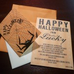
Last night, we found two envelopes from Hello Lucky in our mail – one for me, one for Angelica. Each envelope contained a “Happy Halloween From Hello Lucky” postcard and a blank Halloween card with envelope.

The postcard has a playful poem that basically says “Hey, it’s Halloween now, but soon it’ll be Christmas, so send this free card to someone now and make sure to plan ahead so you can send awesome cards for the holidays. Oh, and by the way, here’s a coupon code.” There are two codes: one for 3 free samples of holiday cards, and another for 15% off site-wide. The coupon codes have a pretty tight expiration date, which is good. This should help drive home the point of “It’s go time. Order your cards now.”

This is very interesting to me. I’m a jaded online marketer, so of course I immediately started dissecting their strategy. But I’ll admit I was totally jazzed to get a Halloween card from Hello Lucky, even if Angelica did get the cooler card.

I like to imagine that companies that are truly driven by passion for making awesome stuff and creating delightful experiences come by these kinds of marketing ideas in a “Hey, wouldn’t it be cool to just send some cards to our customers?” kind of way, with the number-crunching and ROI scenarios coming afterwards. Look, I know that this is essentially a free sample mailer. Not exactly a groundbreaking concept, but kickass in execution. I seriously doubt the average Hello Lucky customer who receives one of these is going to say, “Well, duh, they’re just sending me a free card so I’ll but more stuff from them.” They’re going to say, “AWESOME!”

  1. The sample is an excellent reminder of how great the Hello Lucky cards are. I get points for sending someone an awesome card, and Hello Lucky gets their cards in front of another potentially new customer.
  2. The timing is perfect – close enough to Christmas that it makes sense to buy holiday cards, but not so close that anyone will worry about whether the cards will arrive in time to mail out in time for Christmas/Hanukkah/Kwanzaa/Festivus.
  3. In spite of having not one, but two coupon codes, the whole thing feels more like I just got something from a friend, not some smarmy hard-sell marketing materials. Plus, I get the option of using coupon code A to get more free stuff, or coupon B to get 15% off. Beautiful, and a nice test to see what folks will respond to.

Hello Lucky faces significant challenges in getting folks to order directly from them online. I don’t have any data on this, but I’d bet I’m not the only person who picks up cards on the way to the event the card is celebrating. It’s easy to grab a crappy, last minute greeting card at the grocery store if I’m not planning ahead. Mailing cards in a timely fashion? Very difficult for me.

This campaign short-circuits those issues, with a physical reminder of the very high quality of Hello Lucky’s cards and a sensible nudge to get a jump on the holiday season. I’d bet lots of folks will be thankful not only for the coupon, but for the gentle reminder as well. Nice work.

Carving Pumpkins, Halloween 2010: Templates Are For Suckers

I love Halloween, always have. One of my favorite things about Halloween is carving pumpkins. I never use a template; I prefer to come up with my own crazy designs.

This year, I found a really great pumpkin at Clancy’s over in the Inner Sunset. He was a squatty little fella with a unique shape, like he already had a face before I even started taking pieces out of him. I almost wanted to leave him as-is. Almost…

Angelica and I had a small pumpkin carving party at our place last night. I went to work on Mr. Spooky Jack O’Lantern, capitalizing on his interesting natural shape. I used a narrow blade and a small scraper for removing surface material. The wire is simply paperclips I cut to length and bent to fit.