Facebook Confirms: Real-Time Ad Targeting for 100% of Users Coming Soon

Soon, like this week – less than two weeks since AdAge revealed Facebook was testing real-time targeting for Facebook Ads. I received an email from my friendly neighborhood Facebook Ads rep today, telling me:

Happy Monday,

In the coming week, we will expand our Real-Time Targeting test for Facebook Ads on Marketplace to 100% of users worldwide. This targeting feature can speed up the delivery of ads in real-time based on a set of qualified actions a person takes on the site. We’re using the same data that we already use to serve ads to our users, but this enhancement will allow users to see ads updated in real-time based on their activity. We’re excited about this test, because we think it makes your ads more relevant to users by allowing you to reach users at a prime point in the purchase cycle – right when they are indicating intent. There is no change in the ad product itself or to user privacy, and no action is necessary on your current Marketplace Ad campaigns—real-time targeting will happen automatically for people who become a part of your target audience.

How it works:

A user takes one of the following actions:

  1. Updates their status on Facebook
  2. Posts content on a person/Page/Event Wall
  3. Likes a Page from the Search Results page

In real-time, we can target specific keywords from the text the user entered or the Page they liked and update the 1-5 Marketplace Ads they see that is relevant to the keyword/concept.
For more info on real-time commenting, please refer to the following article:

https://www.facebook.com/note.php?note_id=496077348919

Happy Monday, indeed. Seriously – this is big stuff.

On one hand, I’ve talked to some folks who are freaked out and think there’s some new privacy issue here. It’s the usual “OMG! They’re watching me! I’m quitting Facebook!” News flash: they’ve been watching you all along.

On the other hand – for advertisers, this is huge – we can engage Facebook users in the moment. TONS of potential.

But the jaded side of me thinks we’ll keep seeing more of the same poorly targeted ads. The tools have always been there, but lots of advertisers still do a really bad job with their Facebook campaigns. Poor strategy is poor strategy – making it faster doesn’t make it any better. AT&T  will still show me their “Sign up for AT&T” ads every time I post in frustration about the “network quality” in San Francisco- they’ll just be quicker about it. And I’ll get more of this ridiculousness, in real-time!

Friday Afternoon: Writing My Bio

One of the most useful pieces of feedback I’ve gotten from my mentors is “You rock. Don’t be so uncomfortable calling yourself an expert.” I hate talking about myself – it always feels like an exercise in self-aggrandizement, even if I’m just saying “Yeah, I guess I make a pretty good cup of coffee.” So every time I have to come up with any sort of bio, I agonize over it way more than I should, worrying that I’m not quite dialing the mixture of  my skills, knowledge and expertise with my punk/rock ‘n’ roll/DIY/gearhead roots and attitude.

Anyway, I had to write a new bio this week. Here’s my rough draft:

“Surj is a seasoned, passionate ecommerce devotee with experience in many industries. An online marketing generalist with deep experience in all forms of customer acquisition and retention, he’s most passionate about email marketing, search marketing, and affiliate programs. A die-hard gearhead, if he’s not contemplating his latest world domination perfect customer acquisition plan, Surj is most likely riding his motorbike in search of good rock ‘n’ roll or coffee.”

Aw crap, I forgot “Likes to play poker, but not very well.”

Solving Customer Experience Problems with Social Commerce: Infused Facebook eCommerce

Go Smile, where I’m General Manager of eCommerce, was featured in the Jill’s Steals and Deals segment of the Today Show in late 2010. Obviously, this was huge in many ways – the traffic spike was unbelievable. The website was almost instantly brought to its knees.

I’d been talking to the folks at Infused Commerce about their Facebook Store solution, and reached out to them to see if we could get something live quickly enough to help serve the massive number of folks coming to the site as a result of the Today Show deal. Keep in mind, this was short term demand – the deal was supposed to last 24 hours, and although we had upgraded our servers in preparation for the traffic, it wasn’t enough. We were turning away site visitors – a bad experience for would-be customers, and a loss of opportunity in terms of new customers, email signups and brand reputation.

Incredibly, the guys at Infused were able to get our Facebook shop live within hours. We posted the link on our temporary home page, and by the end of the day had processed a huge number of orders through the Facebook store – almost twenty times our normal daily website order volume in a single day. The launch was a resounding success, and really helped mitigate the poor experience experienced by some folks having issues ordering on the main site.

Unfortunately, due to some issues we ran into while trying to integrate with our fulfillment partner (who will remain nameless) we had to take the store down temporarily. We thought it’d be down for a few weeks at the most, but due to a an ridiculous comedy of delays and freakouts from the fulfillment company, it took months to make the integration happen.

We finally launched the Go Smile Facebook store again last week. We haven’t been pushing it much just yet – taking a few orders and watching for issues with the fulfillment integration. But I’m planning some excellent campaigns very soon – this is a powerful tool to drive not only orders and revenue, but fan count and engagement. More to come on that soon.

Right now, the Infused Facebook shop application works in typical product feed fashion – very simple. The store itself is a Flash app that lives in an FBML tab on your company’s Facebook page. If you’ve sold stuff or advertised on Amazon, you’ll be able to set up your Facebook shop in your sleep. The Infused team sets up the store with your brand colors – you just need to provide some basic files like a logo and a “front door” image along with your product feed, and you’re ready to roll. The orders are pulled from a secure URL. Easy peasy.

I can’t say enough nice things about the Infused team. While the curent beta version of the Facebook shop sports a pretty basic feature set, they’re moving fast – they’ve made vast improvements to the product since I first talked to them a few months ago. There are other companies doing this, but it’s been a pleasure working with them. It’s a classic startup story – they’re new and hungry, with a small agile team capable of moving very quickly. Their customer service has been excellent, and they’re attentive to our needs. They eat up feature requests like candy, and in some cases stuff I’ve asked for has shown up a few hours later! The pricing is excellent, too – less than most companies give up to affiliates, and there’s no commitment.

Small brands – this is an easy, effective way to make your Facebook page a powerful tool in your customer acquisition toolbox. The buy-in is very small, and implementation is incredibly easy and fast. Do it now!

Distance to Discount Ratio? How About a Work to Incentive Ratio?

Today, TechCrunch called out some numbers from the folks over at JiWire that quantify how far people are willing to travel to get higher levels of discounts. Wait – people will travel further for bigger discounts? No way!

Kidding aside… first, this overly simplified take on the data makes me think a lot of people way undervalue their time. 40 percent of respondents will travel up to an hour for a 40% discount on a $100 item? People – haven’t you heard of Woot?

Second, while the implications of this are pretty obvious for location-based promotions, I’d love to see some data that tells the story of how much “work” people will do in exchange for incentives online. How many friends’ email addresses will Joe sell out share in exchange for more vegetables for their virtual farm? How many completely irrelevant offers will Franklin click on to build up points for a gift card? How many times will Susie refresh a page to get a free sample worth less than a buck? What are the incentives required to get engaged users of your product to enthusiastically tell their friends?

I ran a promo in late 2010 where a beauty product that’s normally $89 was offered on an extremely high profile national TV show for just $10. The resulting traffic to the website was roughly 500 times average. The site slowed to a crawl, and would-be customers had difficulty purchasing. One of the most amazing things about this offer was the number of people who complained angrily via Facebook and the more traditional customer service channels that they’d been “refreshing for ten hours” to make the purchase. Important feedback, and very helpful in understanding the level of emotional investment in the product, but the time investment people were willing to give up was way higher than I’d have suspected. The vocal folks in this case were a small minority compared to the overall sales, and I think it’s important to not place too much value on the anecdotal information. Still, ten hours of refreshing to save $79 on a non-essential cosmetic product?

Jockey.com Email Marketing: Text, Please

It always bums me out when I’m talking email marketing with someone and they say something like “Why do we have to use all this text? Can’t we just put some images in there? [some huge brand] does it, and they must know what they’re doing!” I’ll usually go through the explanation of how images don’t always load, and it’s good to have your call to action and other messaging visible even when they don’t. Sometime they get it, other times they fall back on “Yeah, ok – but what about [some huge brand]? Why would that do it that way if it wasn’t the best?” Because we all know how every large brand is awesome at email marketing.

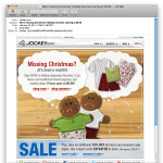
Anyway… Trolling through my emails this morning, I noticed this subject line: “We’re missing Christmas! Holiday favorites starting at $9.99.” Christmas, eh? Seems a little late for that messaging. But I was intrigued, and opened the email. Nice work, Jockey Email-Jockies!

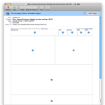
But what did I see when I opened the email? A whole lot of nothin’!

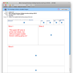
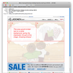
As you can see, without images loaded there’s not a whole lot to look at. The bummer is, it’d be super easy to do something cool with this by slicing up the image a bit more creatively, and using text in the white area. In the first image below, you can see the slices the Jockey email marketers used. In the second image, I show you how I would have done it.

Instead of just slicing up a mockup and calling it a day, I’d slice the images a bit differently, put ’em in a table and leave a white cell to place the text in. My basic table structure would look like this:


<table border="1">
<tr>
<td rowspan="2">Slice 1 here.</td>
<td>Slice 2 here</td>
<td rowspan="2">Slice 3 here.</td>
</tr>
<tr>
<td>Text here!</td>
</tr>
<tr>
<td colspan="3">Slice 4 here.</td>
</tr>
</table>

Easy, right? Well, those of us who code an email now and then know it’s not that simple, but that’s the gist of it. Now, if images don’t load, the recipient doesn’t have to wonder whether it’s worth loading images to see the message – it’s there in all its textual glory! Just be sure you test your code in the usual email clients to verify the text won’t blow up your table.

Look, I get that sometimes brand guidelines require certain fonts for everything, so you have to use images with those fonts in them. I also get that sometimes things are rushed. But it often doesn’t take much extra work to make sure folks are seeing your message whether images load or not, and it’s worth it. Text rules!

It’s Cool, I Already Have an iPod Anyway

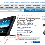
Does this mean they're sending me an iPad? As I’ve mentioned before, I subscribe to a lot of emails. Marketing research and all that. Wading through my “lists” inbox tonight, I noticed that the Costco has a Kensington iPad case with a built-in battery. Now, I don’t even have an iPad, but Angelica does, and I reckon with its already amazing battery life and the extra five hours this thing claims to provide, the iPad oughtta last us through the next nuclear winter, at least. And, it’s got a freakin’ kickstand, which according to that annoying animated billboard on the Oakland side of the Bay Bridge is a REALLY BIG DEAL.

So I click through, and what to my wondering eyes should appear? A free iPad from Costco!

Ok, it doesn’t actually say I get a free iPad, but it does say “iPod not included,” which I’m assuming is intended to clarify (for the non Tech Crunch readers) that you get an iPad, not an iPod.

AWESOME. Placing my order now.

Subject Line Experimentation: Special Characters – Genius or Garbage?

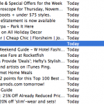
Macworld email marketing subject line experiment screenshot.
Macworld getting a little crazy with the subject line.

I subscribe to a LOT of email – I like to see what other email marketers are doing. Because of this, I get so much email that I’m in constant email overload mode (sounds familiar, I bet) and it takes something pretty spectacular – or really lame – to get my attention.

Taking a peek at my subscriptions inbox this morning, I saw an email from Macworld with a three character subject line: –>. That’s not me pointing at something, that’s the subject line. An arrow.

Ever the jaded online marketer, my first thought as I glanced through my emails was “Oops, someone screwed up personalization again.” Then I thought maybe some really crappy spam had snuck into my inbox somehow, until I saw the from: Macworld Gems.

I think overly gimmicky subject lines can be a bit of a risk, and tricks like this are usually one-shot deals. But, as we always say, “test, test, and test s’more!” So what were the email marketers at Macworld thinking on this one? Maybe in a vertical preview pane, the “look over here” arrow mechanism works. Maybe they just thought it’d be eye-catching.

For me, it just looked weird, like a mistake. But… I noticed it. What would a “normal person” (non-email marketer) think of this?

Hello Lucky Halloween Cards and Awesome Customer Retention Strategy

I’m a big fan of Hello Lucky. They make awesome letterpress cards – nice heavy paper and cool designs, especially the cards with monkeys on them. I’ve purchased lots of cards from local shops when I’m short on time, but I mostly I order direct from HelloLucky.com. Angelica has also ordered directly from their site.

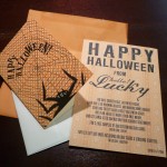
Last night, we found two envelopes from Hello Lucky in our mail – one for me, one for Angelica. Each envelope contained a “Happy Halloween From Hello Lucky” postcard and a blank Halloween card with envelope.

The postcard has a playful poem that basically says “Hey, it’s Halloween now, but soon it’ll be Christmas, so send this free card to someone now and make sure to plan ahead so you can send awesome cards for the holidays. Oh, and by the way, here’s a coupon code.” There are two codes: one for 3 free samples of holiday cards, and another for 15% off site-wide. The coupon codes have a pretty tight expiration date, which is good. This should help drive home the point of “It’s go time. Order your cards now.”

This is very interesting to me. I’m a jaded online marketer, so of course I immediately started dissecting their strategy. But I’ll admit I was totally jazzed to get a Halloween card from Hello Lucky, even if Angelica did get the cooler card.

I like to imagine that companies that are truly driven by passion for making awesome stuff and creating delightful experiences come by these kinds of marketing ideas in a “Hey, wouldn’t it be cool to just send some cards to our customers?” kind of way, with the number-crunching and ROI scenarios coming afterwards. Look, I know that this is essentially a free sample mailer. Not exactly a groundbreaking concept, but kickass in execution. I seriously doubt the average Hello Lucky customer who receives one of these is going to say, “Well, duh, they’re just sending me a free card so I’ll but more stuff from them.” They’re going to say, “AWESOME!”

  1. The sample is an excellent reminder of how great the Hello Lucky cards are. I get points for sending someone an awesome card, and Hello Lucky gets their cards in front of another potentially new customer.
  2. The timing is perfect – close enough to Christmas that it makes sense to buy holiday cards, but not so close that anyone will worry about whether the cards will arrive in time to mail out in time for Christmas/Hanukkah/Kwanzaa/Festivus.
  3. In spite of having not one, but two coupon codes, the whole thing feels more like I just got something from a friend, not some smarmy hard-sell marketing materials. Plus, I get the option of using coupon code A to get more free stuff, or coupon B to get 15% off. Beautiful, and a nice test to see what folks will respond to.

Hello Lucky faces significant challenges in getting folks to order directly from them online. I don’t have any data on this, but I’d bet I’m not the only person who picks up cards on the way to the event the card is celebrating. It’s easy to grab a crappy, last minute greeting card at the grocery store if I’m not planning ahead. Mailing cards in a timely fashion? Very difficult for me.

This campaign short-circuits those issues, with a physical reminder of the very high quality of Hello Lucky’s cards and a sensible nudge to get a jump on the holiday season. I’d bet lots of folks will be thankful not only for the coupon, but for the gentle reminder as well. Nice work.

Anthony.com Order Experience Review

While working at SkinStore, I became a bit of a manly skin care product whore. OK, so maybe “whore” is a bit too strong, but I do have a small set of products I like and stick to pretty religiously. One of these is Razor Burn Repair by Anthony Logistics For Men, basically a post-shave moisturizer – very soothing. I have very sensitive skin, and this stuff works wonders.

I usually order from SkinStore, but I’ve been actively ordering directly from brand websites lately, to get a feel for the experiences they offer and see what they’re up to. So I ordered some Razor Burn Repair directly from Anthony.com on 9.21.10.

I like the Anthony website – I think it does a decent job of infusing the experience with founder Anthony’s personality without being ridiculous.  But I got a surprise when I reached the checkout flow. Shipping was expensive – $9.11 for a single four ounce bottle! I really felt like that was excessive and almost bailed out, but I bit the bullet so I could check out the customer experience.

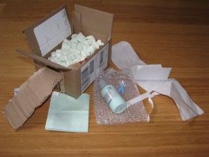
Photo of order from Anthony.com - they sent me their waste!
Come on, guys - For $9.11 in shipping I shouldn't have to handle your trash for you!

I got the package 8 days later. Not cool, considering lots of sites ship for less and get me my goods much faster. Even worse, Anthony uses old style peanuts – messy and not biodegradable, and the product was wrapped in a bubble wrap bag. And while I appreciate the personal touch of a packer’s signature on the inside of the box, presumably verifying correct products, I’m surprised and bemused that they decided to send me the garbage my order generated too.

All kidding aside, this kind of thoughtless, wasteful packing and shipping always bothers me, enough to discourage me from ordering again. It’s far too prevalent in the ecommerce world.  And Anthony could do a better job of optimizing shipping costs and time.